Grafana: Graph - Noise Range
Aus Wiki-WebPerfect
Version vom 16. September 2021, 14:32 Uhr von Admin (Diskussion | Beiträge)
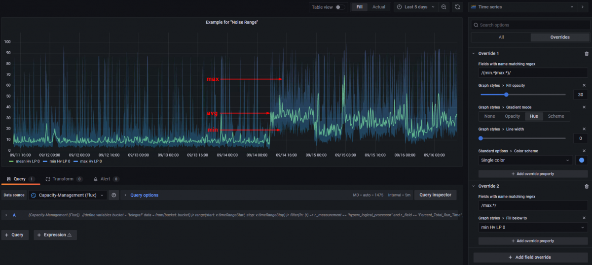
If you want a Grafana Graph that shows the average CPU usage as a line but also the min and max value as a area in the background for example like the image below, then following this site.

Example Flux Query
The image above is based on the following Flux query:
//define variables
bucket = "telegraf"

data = from(bucket: bucket)
  |> range(start: v.timeRangeStart, stop: v.timeRangeStop)
  |> filter(fn: (r) =>
    r._measurement == "hyperv_logical_processor" and
    r._field == "Percent_Total_Run_Time"
  )
  |> group(columns: ["instance"])


mean = data
  |> aggregateWindow(every: 10m, fn: mean, createEmpty: false)
  |> set(key: "_field", value: "mean")

min = data
  |> aggregateWindow(every: 10m, fn: min, createEmpty: false)
  |> set(key: "_field", value: "min")

max = data
  |> aggregateWindow(every: 10m, fn: max, createEmpty: false)
  |> set(key: "_field", value: "max")

union(tables: [mean, min, max])
  |> pivot(rowKey:["_time"], columnKey: ["_field"], valueColumn: "_value")
  |> keep(columns: ["_time", "instance", "mean", "min", "max"])
Grafana settings
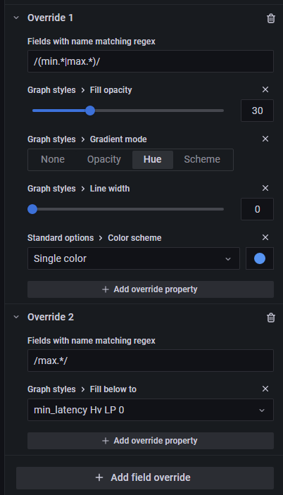
For the visualization like the image above, you have to settings in the "Graph styles" like in the image above + the "Overrides" from the following image:
